RAGNAR INTERVIEW
Animation Development.
Thursday, April 27, 2006
BROUGHT TO YOU BY THE CHARACTER DESIGN BLOGSPOT
IF YOU WOULD LIKE TO SEE MORE CHARACTER DESIGNERS GO TO THE HOME PAGE BY CLICKING HERE
THE INTERVIEW
Tell me a little bit about yourself, about your life? Where did you go to school, and what classes did you study? What helped prepare you to become the artist that you are today?
I come from a family of artists. My father, brother and sister are artists as well. We all grew up drawing, playing music, taking pictures etc. It's all I've ever really done with the exception of a few years from about the age of 18-21 when I didn't even pick up a pencil and instead traveled and tried to just live and experience the world.
Eventually I found that I was more interested in traditional (graphic) design than anything else and decided to finally go to school after working some terrible jobs in the screenprinting business cutting endless rolls of rubylith and watching my hands slowly rot away from the chemicals in the stat camera room.
I graduated from the Graphic Design department at Art Center College of Design. While I do very little graphic design these days I feel that it really shaped how I approach illustration.
How do you go about designing a character, and what goes through your mind, from start to end?
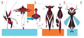
I always start with written notes. The basics- who, what, where and when. Even at this stage I work big to small by starting with general descriptives and closing in on the specifics. Such as- short, fat boy- This is enough to give you a silhouette and tells you WHAT the character is. The following begins to tell you WHO the character is-From there- 9 years old, red hair, lots of freckles, squinty eyes, crooked nose, dirty shirt, pants two sizes too small, unlaced worn high-top sneakers, grubby backpack covered in pins and patches filled to capacity-bursting at the seams with stuffed animals. What is the problem and how do you solve it in a way that serves the story? It's always an issue of form following function. How can the character be distilled? What context do they exist in? I always start with the macro and close in slowly. Large shapes and silhouettes enclosing smaller shapes and details. I think that if you start large and address the broad strokes you find that the details begin to define themselves.
What do you think really helps you out in designing a character?
Context. It always has to come to down to context. What is it that you want the character to convey and do? Does the design allow them to act and move in a way that serves the story? However you can't dismiss the x factor either. Sometimes, or maybe most times, a good drawing/design defies logic and intent and exists in spite of our efforts.
From your own experience and maybe from some people that you know, what should we put in our portfolio and what should we not?
Simply put in the best, most unique, most inspired work you have. Stay focused. It's all going to be crap that you can't stand to look at in a couple of weeks anyhow. Or at least it should be if you're learning, growing and working at the rate you should be. Personally I don't really want to see life drawing in there. It should be a given that you have great life drawing skills and it should be evident in your work.
What are some of the things that you have worked on?
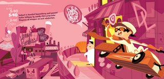
I've worked in development at most of the animation studios including Nickelodeon, Disney, Cartoon Network and WB mostly for TV, but a bit of feature stuff here and there. I really like my independence so I don't generally stay on shows if they go into production. I've really been enjoying doing books the past couple of years and have produced a few Chromaphile, Got Your Nose and Izzy's Very Important Job. I do the occasional comic cover. I have few gallery shows every year and I do a toy design and other licensed stuff. I just finished directing a short for Disney based on Got Your Nose and will direct another later this year.
Is there a character design you have done that you are most proud of?
Time affords you the luxury of hindsight and you end up being your own harshest critic. The rationale and reasoning that initially leads you down a certain path is soon forgotten and your left with something that can only be judged aesthetically and it all somehow seems flaccid. That being said I was able to capture much of my daughter's character Izzy in my book Izzy's Very Important Job. I'm also fond of my characters Millie Minimum and Slumberjack. A couple of years ago I did some designs for The Batman that I liked. They didn't get used but I looked at them again recently and still think a few are pretty good.
What are you working on now? (If you can tell us)
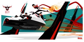
I'm in varying stages of production on several books. First up is a follow up to my pin-up book Chromaphile. After that is Kings Of The Road, a book about contemporary itinerant laborers. I'm also working on a couple of new children's books- Jack and Rustle and It Grew There as well as an “art of” book for an animated feature I've been working on called Big City. That should be out this coming summer. I just did a redesign of a major property at Disney that may see the light of day. Really just more of the same I guess.
Where is the place you would like to work if you had a choice?
Fortunately I do have a choice and I get to work here in my studio a few blocks from my home and family.
Who do you think are the top character designers out there?
Currently I really like Steve Lambe, Kirsten Ulve, Chip Wass, Sean Galloway, Bengal, Juan Bobillo, Claire Wendling, Mike Mignola, Darwyn Cooke, Josh Parpan, Anna Chambers- there are so many.
How do you go about coloring the character, what type of tools or media do you use?
For finished work I generally use Adobe Illustrator. For roughs, or if it's just for myself I use pens and markers on copy paper.
What part of designing a character is most fun and easy, and what is most hard?
That's a tough one to untangle. All parts are fun, easy and hard. I've never been very good at turns and model sheets, so that's always the least appealing to me and why I generally don't do them.
What are some of your favorite character designs and least favorite, which you have seen?
My least favorites are Shrek, Rugrats and Dora The Explorer. All of which are hugely popular and successful, so consider that when you read my other opinions.
Favorites- Krazy Kat and Ignatz, Darth Vader, Charlie Brown, The Banana Splits, Bone, The Octopus -from The Spirit, Hot Shot Charlie -from Terry and The Pirates, Scary Girl, Daffy Duck, Hellboy, Buddy Bradley, T28, Lupin, Auggie Doggie, Sylvester, Mr Tawny, Frankenstein- Dick Briefer's, Wacky Racers, Robby The Robot.
What is your most favorite subject to draw? And why?
Odd, unique faces because the variations are endless and the nuances can be so difficult to capture. When you do capture that indescribable something the feeling is really gratifying. And monsters and girls.
What inspired you to become a Character Designer?
Seeing others do it so well. Wanting to draw funny, odd, cool pictures and tell stories.
What are some of the neat things you have learned from other artists that you have worked with or seen?
I'm constantly learning and refining. It seems like every day I'm starting over from the beginning.
What wisdom could you give us, about being a character designer? Do you have any tips you could give?
At the risk of sounding flippant- never get it “figured out”. Never apply the solution of your last problem to the next. Always start from scratch.
If people would like to contact you, how would you like to be contacted?
http://symptomatica.blogspot.com/
http://www.littlecartoons.com/
Finally, do you have any of your art work for sale (sketchbook, prints, or anything) for people that like your work can know where and when to buy it?
We have stuff for sale from time to time on the website, but there are always links to people selling books, prints etc. on the blog listed above.
You can also find his Books and Prints at SktchMart here and here
Subscribe to:
Comments (Atom)


